Top Web Design Trends for 2022 Every Business Needs to Know
Table of Contents
You may have heard the phrase “content is king” tossedaround. And justifiably so. Content is king, but visual content is the emperor who cannot be dethroned…ever.
Visuality is a game-changer. We’re drawn to gripping graphics, aesthetic appeal, and multi-sensory experiences as humans. Think about it. If you’re offered a chunk of plain text and an engaging infographic, which of the two will you reach for? The latter, right?
Visual content is powerful, compelling, and effective. Despite its significance, many business owners still end up dropping the ball.
You know where we’re going with this…web design.
If your siteisn’t modern, appealing, engaging, interactive, and user-friendly, your audience will “bounce”, leaving you with a high bounce rate (loss of web visitors). Undoing the damage is simple. You implement a whip-smart web design plan. That’s what we’re focusing on today!
Let’s look at ten of the most popular website design trends. What are web users looking for? What’s the easiest way to put these trends into practice without breaking the bank? We’ll cover everything. Let’s dive in!
Website Design Trends For 2022
1.Smart Personalization
There’s a reason why Meta is always reworking its algorithm, trying to find ways to make user experiences more rich, personalized, and hyper-specific.
The power of personalization cannot be ignored in 2022. When people visit a website, they shouldn’t be fed the same ol’ information. This is a lazy approach that lands many businesses in trouble. When your competitors pull out a personalized web design strategy, your sales will plummet.
Today, the concept of personalization is an easy favorite in the web design and development industry. Why? Because personalization sells!
Think about it. Let’s say you’re redecorating your house and need new doors. As the project continues, you’ll browse multiple door design and manufacturing sites in your location. If these businesses are smart, they already have an algorithm in place that picks up on that and presents content based on where you’re located.
Want to take things further? Curate content based on the user’s web history, age, gender, race, etc. These social markers are important. They help you understand patterns and present content accordingly. Your site should be smart like this! Instead of displaying generic content, it should tweak the experience based on the user’s identity.
If a web user living in California scrolls through Pinky’s Iron Doors’ blog, they’ll receive this set of results:
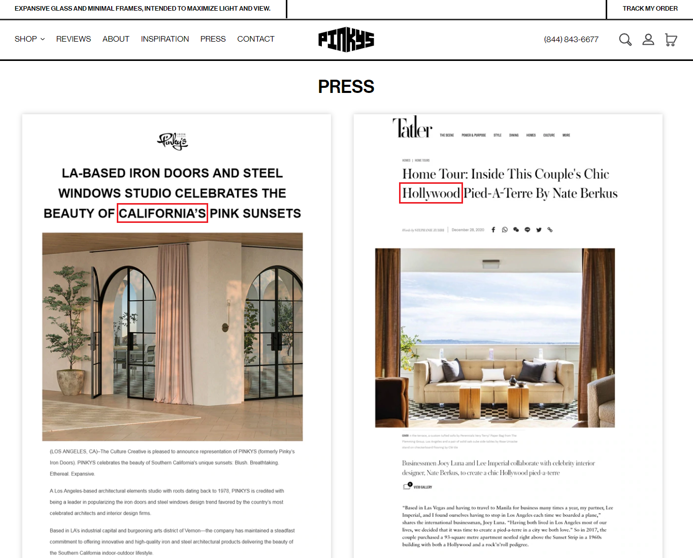
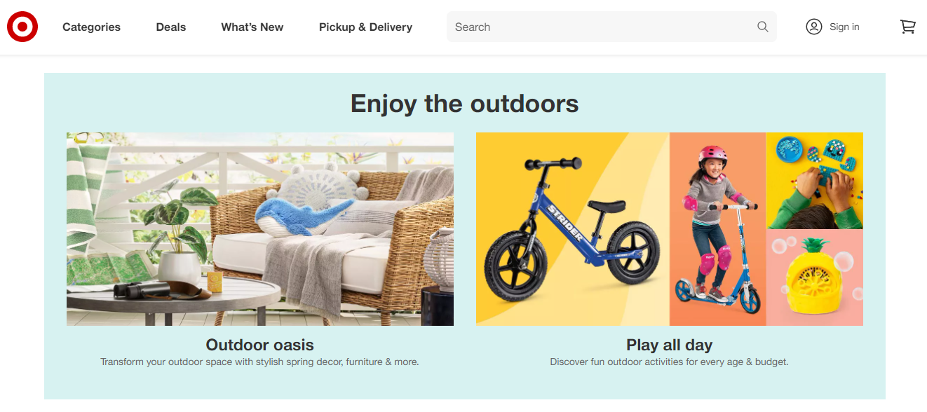
Notice how the webpage is catered to web users living in California. Target uses a similar approach. If you’re a parent who often buys toys, clothes, and accessories for their kids, Target’s intelligent algorithm will pick up on this. You’ll receive a hyper-specific set of results based on your shopping habits when you browse the site. Here’s an example:
As one of the top UI trends for 2022, this neat trick is making the rounds in 2022. With more and more businesses adopting the strategy in some capacity, we’re expecting to see more personalized websites in the coming year.
Speak with your web design and development team. You can start slow if you run a startup or a small business.
We recommend kicking things off with geo-personalization. After you take the first few baby steps, you can venture out into other types of personalization to improve your sales. This tactic is great for conversions.
When web users see content, products, and services that directly tie in with their needs, they’re more likely to make a purchase. The outcome? A pristine bottom line.
Take some notes from Bloomingdale’s book. The moment you land on their site, you receive this prompt:
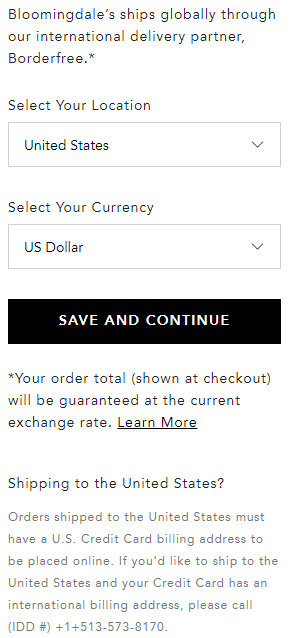
As you enter your country and currency, the site will offer you a geo-personalized experience accordingly. Genius, right?
This approach is a lot more transparent. Web users know that their location is being tracked. You can customize each user’s experience and make sweeter sales.
Over time, this will also help improve your brand identity. Instead of creating a base of indifferent buyers, you’ll end up creating a base of loyal customers who feel strongly about your brand.
2.App-Like Experiences
Move over, clunky design. There’s a new sheriff in town: app-mimicking design!
Not every business offers a mobile app. If you don’t have the budget to design and develop an app yet, don’t worry. Today, more and more businesses are creating app-like websites.
Even if you don’t have an app, you can give your audience an app-like experience. It’s like feeding two birds with one scone!
So what exactly is an app-like experience? Let’s break it down. Mobile screens are small. There’s only so much you can fit into it. If you scroll through any app, you’ll notice less clutter and more focused content.
Apps can’t be overfilled with text and graphics. Sensory engagement is great (visual and auditory engagement). Sensory overload, on the other hand? An easy no. Start by simplifying your website: everything from the animations to the interactivity to the navigation.
Mobile apps offer a dynamic experience. Product purchases, email subscriptions, and social media follow prompts are an easy click away. Make sure your web design is effortless. Walmart’s site is an excellent example:
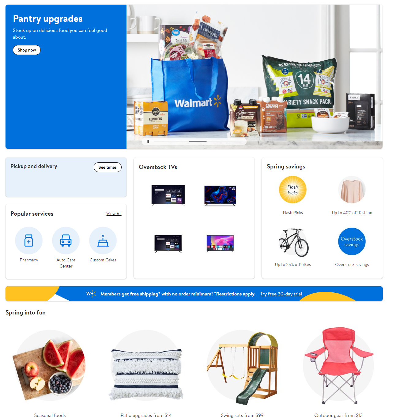
The homepage isn’t crammed with content and graphics, which is often the case.
Instead, you receive a clean, visually appealing, well-demarcated, and neatly categorized homepage. This checks off all the boxes.
Whether the site is accessed from a computer, laptop, tablet, or smartphone, it’ll fit the new format seamlessly and appear cohesive. This should be one of your top web design goals.
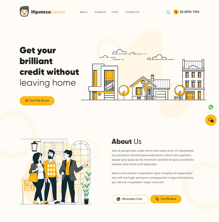
3. The One-Page Site
We’ve been seeing more and more landing pages in 2022. Why? Because they’re incredibly effective.
If you run a startup or a small business, chances are that you haven’t branched out like a more experienced and established business may have.
We can’t think of a mega merchandise retailer like Target setting up a one-page site; that wouldn’t make any sense. However, if your product/service range is small, opting for a landing page is a power move.
Landing pages are extremely easy for most audiences to navigate. It’s an all-in-one page. You get truly everything in one: the products/services, the “About Us/Our Story” section, the “Contact Us” section, and so on.
Use the smart landing page strategy. Sneak in compelling CTAs after every two sections, so your audience is reminded to take an action. This is a great way to move the needle on the conversion scale.
This is an excellent example of a landing page:
There isn’t too much happening. At the same time, enough is happening for the audience to find exactly what they’re looking for and take the desired action.
A well-structured landing page can help reduce your bounce rate and expedite conversions. However, make sure you’re smart with the design.
Avoid cramming your page with too much information. You’ll have to chuck out a lot of text, so be prepared to feel bittersweet about letting that excellent alliterative line or pun go.
Stellar editing will help you make a great first impression on your audience, keep user-friendliness intact, and ensure that your audience enjoys their web browsing experience.
4.Video Incorporation
Sure, your site features engaging graphics. That’s a step in the right direction!
Compared to sites with lots of text and fewer graphics, sites that pack the power of visuality perform much, much better. However, your definition of “graphics” shouldn’t just end at images.
Branch out into animations and videos as well! Today, many sites feature short videos that grab their target audience’s attention.
You don’t have to “embed” videos. Opt for smart videos that auto-play in the background, giving your audience a superior browsing experience! You can add a smart video to any webpage, even the product/service pages. However, avoid going overboard. Strike a fair balance.
5. Memphis Design
You may have been told that a modern, clean, and minimalist site is the way to go. And that’s true to a big extent!
However, not every audience is looking for a neutral web design. As a business owner, you should have a good grasp of your target audience’s preferences and dislikes.
Let’s say you offer legal support to clients in their 30s, 40s, and beyond. This is your primary target audience. Of course you can’t choose over-the-top graphics. But if you run a dating app for young folks in their 20s and 30s, you can definitely welcome exciting splashes of color and some gaudiness.
This is Memphis design in a nutshell. As one of the defining aesthetics in the 1980s, Memphis design is known for its kaleidoscopic colors, shapes, and patterns. The goal is to break away from the monotony and take web users on a visual adventure that gets better and better with each scroll.
Here’s a great example of a Memphis-style website:
6.Take Your Readers On A Journey
While much of the world has seen the better part of their last two years cooped up in their apartment, their passion for adventure and seizing the day persists. Modern web design takes the feeling of adventure and discovering the unknown and visualizes it in its presentation. Many sites in 2022 have made it a web design standardto feature photos of places that are both natural and urban.
The web can be a detached place where it’s your job to establish a connection with the reader. Instead of just leaving a blank space, creating a note that says “made with love in mind” or showcasing an image of your favorite local spot can help visitors connect with you.
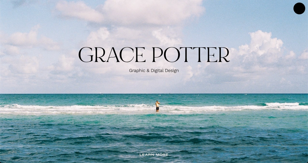
For instance, even though Grace Potter’s work isn’t directly related to the ocean, her landing page still features a beautiful image of the sea. This image helps visitors feel like they’re in her world.
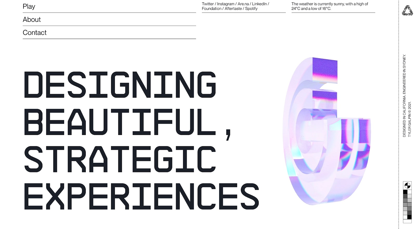
7.Fewer Images
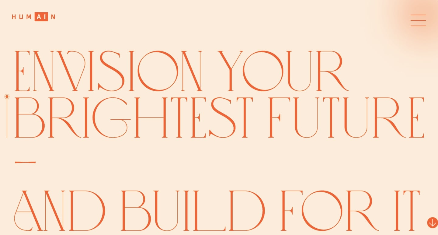
This year, many designers are ditching the use of illustrations and photos for hero sections and landing pages. Instead, they’re focusing on creating content-focused pages that speak with design.
Humain implemented this strategy in their newly-designed webpage, and it’s worked wonders. This abstract take on web design will make waves in the coming years as more designers pick on to it. While going without images helps create a bit of mystery, it also excitesvisitors todiscover what’s next.
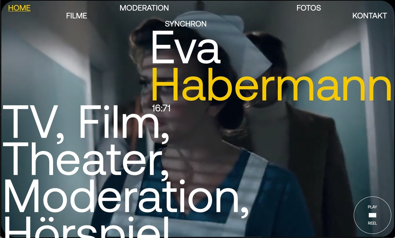
Typography of unusual size is a bold design trend used in both minimal and maximalist designs. It can be used to create visual elements that are both unique and engaging.
Daniel Spatzek created a website for Eva Habermann that combines large text with a moving film portfolio. The resulting design helps viewers see more while also giving them the right amount of contrast.
8. Micro Animations
Attention spans are dropping, and with more content and media at a person’s disposal at any given time, web design must adapt to this change by providing information that’s quick and memorable. Visitors are constantly on the lookout for quick and simple videos and social media posts only a few hundred characters long.
One of the best ways to catch people’s attention is by making them look at your website in animation. This strategy will allow them to spend more time browsing it without it feeling like a chore.
One strategy that can help you catch their attention is incorporating moving images into your background images. This can be done by placing them on the top section of the site.
When using micro-interaction and animation, ensure that the colors do not clash. Also, reserve vibrant colors such as red, yellow, and orange to highlight the interactions and moving images. These colors will make the images and interactions more prominent.
Pro Tip: Make sure that the animations are not over-animated. This can cause them to be distracting, and it can prevent them from interacting with the designs.
9. Modern Minimalism
If you’re looking for a more modern look for your website, go for minimal design. This is because it eliminates the need for bold colors and designs.
Contrary to popular belief, minimal design is not dull. It can help businesses stand out from the crowd and attract more customers while also being easier to create simple and effective designs.
For a modern, streamlined look, choose simple and natural elements to complement your brand. For instance, if you’re a skincare company, use leaves and water in the background to create a relaxing atmosphere.
If you’re a clothing brand, consider your website’s colors. For instance, if you’re a Target or Old Navy, use vibrant colors geared toward a more casual feel. Monochromatic colors tend to reflect a more luxurious feeling.
10. 3D Visuals
The late ’00s saw a decrease in popularity for 3D design, with flat icons preferred by many of the leading businesses.
They have since made a comeback and are at center stage in some of the most forward-thinking web designs in the world. Over the years, 3D images have become increasingly popular in web design to enhance the look and feel of a brand, helping boost excitement in your designs and adding another layer to the overall aesthetic.
One of the most important factors that you should consider when creating 3D images is making them bold and large. Make sure that they are high-quality and don’t create confusion. You don’t want to have 3D images on your website just to have another layer of design. While it’s fun to create, 3D design doesn’t work for everyone, so always ask yourself what purpose they serve as an element on your site.
Although 3D images are commonly used in web design, they should only be used in certain areas, such as site headers and hero images. Keep in mind that too many large 3D images can overwhelm the rest of the design.
Having a variety of these images can help boost the overall impression of your brand.
The Bottom Line
If we’ve tried to impart one takeaway to our readers through this blog, it’s that web design trends will constantly change. What was the talk of the town just last year may seem outdated now. That’s why businesses need a modern, forward-thinking, and constantly innovating web design agency to help them gain more conversions than ever possible.
That’s where Search Berg comes in! With thousands of web pages gone live and hundreds of success stories, we’re the leading web design agency to help your internet presence become unmatched.
Contact us today to see how we can help you transform your business through the power of awe-inspiring web design trends for 2022.