
Mobile SEO Checklist for Website Owners That Understand SEO
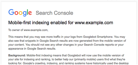
Okay, so mobile-first indexing is finally (and officially) here—but on a larger scale.
Phew Google! You really ran it late this time around.
And we’re grateful you are informing us about particular migrations through the Search Console.
Which brings us to you (no, not you Google; you there, reading this post) and your website.
Is your website ready for mobile-first indexing?
What is mobile first indexing, and why bother?
Traditionally, Google used the desktop version of your website for indexing; your mobile website (www.m.domain.com) was more or less treated as an “alternative” version of it.
In some cases, Google would not even make the effort to crawl and index your mobile website as it considered the practice redundant. And who could fault it, for desktop searches ruled at that time and the volume of mobile search queries was low.
Then, it all changed!
Mobile devices became more popular and outgrew desktop search queries. Internet users were no longer being directed to desktop websites; instead, mobile websites became their new homes. At least, for a majority of them.
This forced Google into a rethink. Since the desktop version of a website can be very different to when it’s pulled on a mobile device, the search experience of internet users was getting compromised.
Google had to come up with a solution.
And it did by introducing mobile-first indexing.
This update treats the mobile version of a website as its primary version.
Crawling, indexing, extracting snippets are all primarily done using the mobile version of websites.
Even the rankings for web pages depend on what Google finds while indexing the mobile website.
That’s not to say the desktop version of a website has lost its importance.
Remember: it’s mobile-first indexing and not mobile-only indexing.
For websites that deliver mobile-optimized experience to users by employing responsive design strategy, this update will have minimal to no impact on their indexing results.
However, if your website uses dynamic serving or a separate mobile URLto deliver mobile-optimized experiences, the pending changes can adversely impact its ranking and consequently your business.
What should you do in that case?
We’ll recommend reviewing the mobile SEO details of your website, and get the issues fixed immediately before the update affects you.
What type of SEO details, you ask?
Mobile SEO checklist for mobile-first indexing update
Start with a review of on-page SEO details.
- Are the meta titles and descriptions optimized for mobile search?
- Do your webpages have strong headlines?
- Do mobile and desktop versions of your website have the same content?
Next, ensure the data on your mobile website is properly structured and follows the same markup that’s present on the desktop version of your website. Any deviations or absence of structure altogether can cause your website to lose visibility on SERPs and suffer in terms of click-through rate.
Does your website have alternate versions of content for different languages and countries?
If yes, and you use hreflang tags for content differentiation, then you’ll definitely want to check if your mobile website has hreflang references updated.
Google strongly advises doing so. Also, make sure the content on your mobile website is paginated.
What is pagination?
Pagination is basically the practice of dividing long-form content into discrete pages.
The desktop version of your website is likely to have the content already paginated. However, pagination may not exist for your mobile website. This can lead to un-indexing of the non-paginated content.
While we’re at the subject of indexing, it’s also worth reviewing the internal link structure of your mobile website.
Quite often, mobile websites show fewer links on a webpage to optimize their users’ online experience. Since internal links help Google crawl your website more deeply, fewer links could affect the indexing and crawling process for your website.
How to ensure a uniform internal link structure between the desktop and mobile versions of your website?
We recommend using a crawling tool(such as Sitebulb or DeepCrawl) to perform the check.
Also, evaluate where those links are placed on your website and reposition them (where needed) to make them more visible and clickable.
Lastly, you would want to review some details of your site’s technical configuration that can impact its ranking. These include:
- Optimizing the redirects
- Checking and increasing the speed of your mobile website
Mobile-first indexing changes are a matter of when, not if. Sooner or later, Google will target your website for migration. It’s better to act now and save yourself from unnecessary inconvenience.
Need help with optimizing your website for mobile-first indexing?
Search Berg is at your service!
We’re one of the leading SEO service providers in the United States. Our expert and experienced SEOs can optimize your website for all Google updates, making it more effective at helping you achieve your business goals.
Get in touch with us today!

