How to Develop a Conversion-Friendly Landing Page
Table of Contents
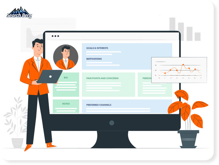
What is a Landing Page? Why Is It So Important?
A Guide to Designing Conversion-Friendly Landing Pages
- The Research Process
- Design an Audience-Centric Landing Page
- Don’t Keep Your Audience Hanging
- Ace Your Calls-to-Action (CTAs)
- Lead with Simplicity
- Equip Your Page with the Right Functionalities
- Make Your Landing Page Mobile-Friendly
- Don’t Push It… Ever!
- Start a Conversation
- Prove That People Love What You Do
- Offer Something
- Optimize, Test, Launch, Re-Test!
Sales. This simple word is the ultimate goal for every business, big or small.
Whether you run a startup, local business, or international company, your sales should be top-notch.
Easier said than done, right?
This may surprise you, but the recipe for stellar sales is actually pretty easy.
This blog will focus on one key ingredient: a kickass landing page that converts.
What is a conversion-friendly landing page? In fact, what is a landing page to begin with? And how can you optimize your landing page for conversions?
Buckle up. Our web design and development specialists are covering the A-Z of designing conversion-friendly landing pages! Let’s begin.
Not getting enough web visits or sales? Let’s get your conversions back on track!
What is a Landing Page? Why Is It So Important?
Before we get started, let’s cover the basics real quick.
A landing page is very simply a distinct, focused, and standalone page that web users “land” on. It’s the entry point for your website.
There are many, many different types of landing pages, but the two main categories are:
1. An All-in-One Landing Page
An all-in-one landing page covers everything: a little bit about your company, your products/services, your USPs, a sign-up page, contact information, and social media links.
When web users click on a specific tab, they’re not taken to a new page. Instead, they’re redirected to the relevant section on the same page. Upstate Laundromat is a brilliant example.
2. A Hyper-Specific Landing Page
This is the most commonly used landing page. Instead of covering everything, it covers one specific thing in detail.
This could be a product/service. It could also be a sign-up page. Or a discount!
Whatever it is, the page doubles down on it to reel in conversions. There’s one main focus to help web users take action.
Landing pages are pivotal because they’re designed to convert. Unlike regular pages, these smart, savvy, sharp pages draw readers in and compel them to act!
If your site doesn’t have a landing page, click here to create one. And if you’ve already got yours sorted, it’s time to optimize it for more leads!
A Guide to Designing a Conversion-Friendly Landing Page
1. The Research Process
Rushing into one strategy after the other almost always backfires. Before you begin, take some time to understand your audience and determine your end goal.
A little bit of research will go a long, long way in helping you launch a high-conversion landing page.
Answer these questions:
- What is the end goal of this page? Do I want to increase sales? Am I aiming for sign-ups?
- What does my audience actually want? Dig into your industry, your audience, and the local demand. For instance, launching a landing page for email sign-ups isn’t the best idea if you’re targeting teens and young adults. Instead, plan one for social media follows. If you’re targeting older folks, do the opposite: focus on newsletter subscriptions. Figure out what will and won’t work before you get started.
- Will my landing page appeal to the big bulk of my audience or just a small portion? If it’s only suitable for a small subset of visitors, add more landing pages to cover the rest of your demographic. You can also make the page more generalized and less specific.
2. Design an Audience-Centric Landing Page
Conversions come from web users. Sure, a specific web template may look beautiful to you. And your team could very well agree! But if it doesn’t appeal to your audience, your conversions will take a hit.
At the end of the day, you’re not buying your products/services; your audience is. Keep them in mind, and set your own preferences aside!
Speaking the visitor’s language is your golden ticket to unlocking shiny sales that don’t lose their luster over time. Here’s how you pull this off.
Take off your marketing hat for a moment and put on your shopping hat. What would the average buyer want from your business?
Take a closer look at Native Poppy’s landing page for flower subscriptions. We’ll share a few snippets:
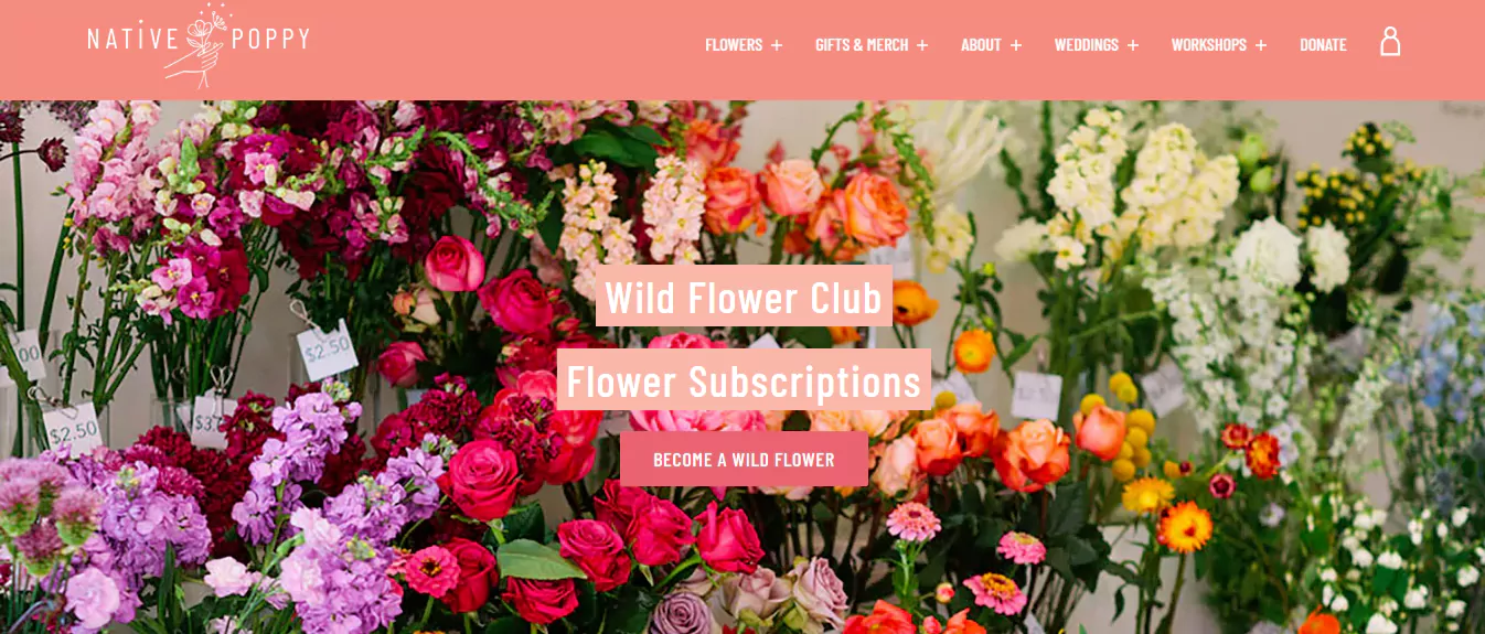
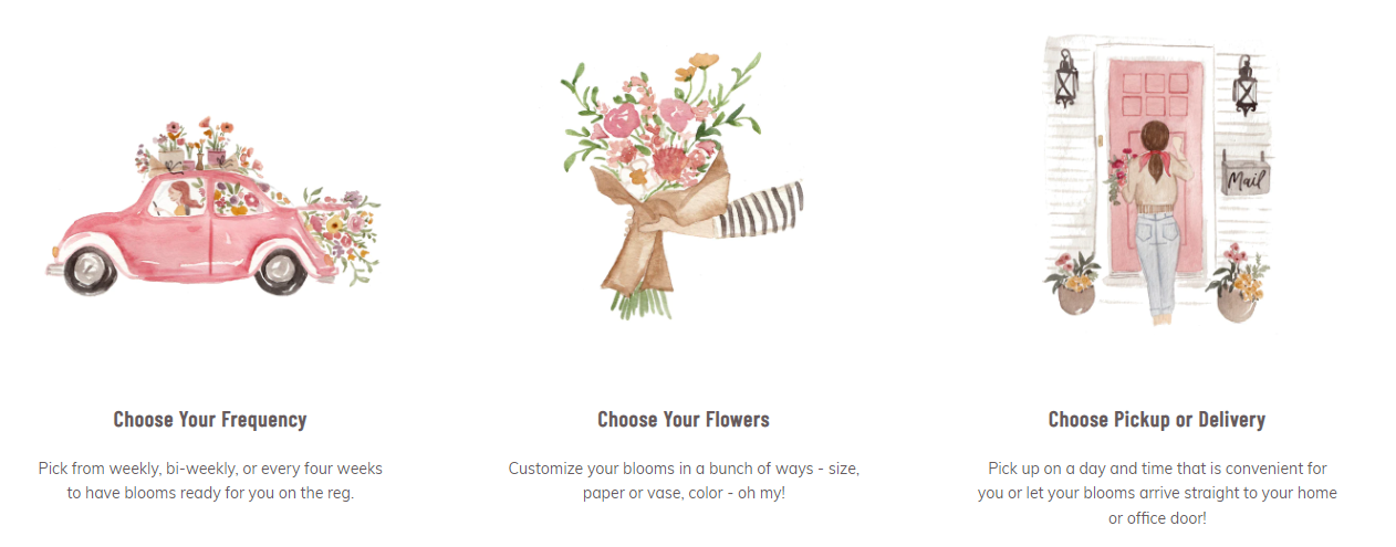

Now you may not like flowers. Your marketing manager may be allergic to them. And your new intern may hate cheesy references! But guess what, that’s exactly what works here.
As you design your landing page and write the web copy, keep your audience in mind every step of the way. We love how audience-centric this landing page is, and that’s exactly what makes it a goldmine for conversions.
As long as you design, write, develop, edit, structure, and optimize for your audience, you’re in for spectacular sales.
3. Don’t Keep Your Audience Hanging
No beating around the bush, period.
Landing pages are known for their brevity, not their comprehensiveness. You don’t have all day to convert your audience. If you fail to get your point across within the first 10 seconds of a web user’s arrival, you’ve lost them.
Get to the point, and make it powerful!
Your unique selling points should be neatly scattered across the page, ideally within the top half. If you haven’t already, make a list of your company’s USPs.
What helps you guys stand out from the local competition? Are you offering better prices? Are your products third-party tested? Do you run year-long sales?
Figure out what gives you an edge over others, and proudly showcase this on your landing page. This is one of the best ways to grab your audience’s attention and compel them to convert.
Think about it. If you’re looking for a new flashlight, you’ll ideally want something with the farthest reach, the highest number of lumens, and the longest battery life.
As you browse through a couple of landing pages, you’ll naturally gravitate towards one that says “12 hours of use, 30% more than top-rated flashlights on the market*”.
Something like this will stop you in your tracks.
That’s exactly the kind of impact your landing page should have! Warby Parker’s brilliant landing page gets this part of the recipe just right:
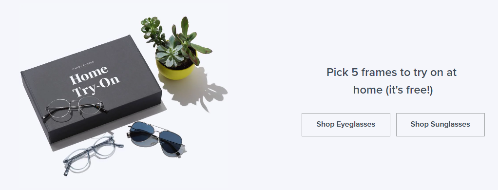
See what we mean? To the point, clean font, easy-to-click tabs, and distraction-free design. There’s no clutter, noise, or drama.
You instantly know this company is letting you try on five frames at home for free. Does the tricky brilliantly.
HelloFresh takes a landing page right out of this book:
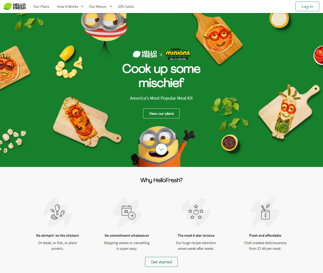
Brilliant, right? Within a few seconds, we know that HelloFresh is America’s most popular meal kit, lets you pick any protein, has 5-star reviews, is commitment-free, and offers great prices.
Waldo also aces this strategy with finesse and aplomb:
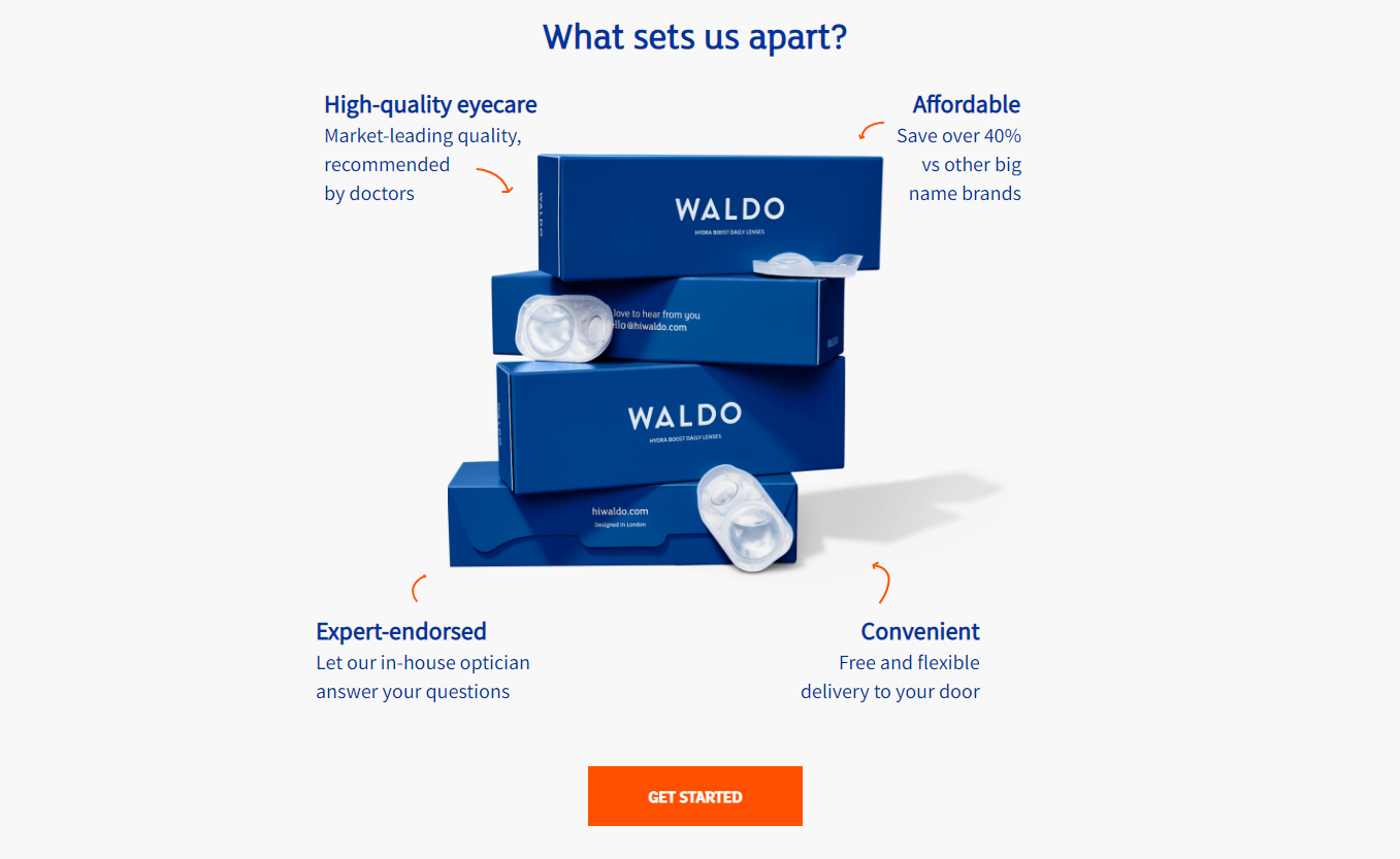
Keep things simple, quick, understandable, and effective. Your USPs will help you win this battle by a mile.
Pro tip: Run a competitor analysis to determine how you stand out against the competition. This will help you come up with more USPs!
Great web copy can help you bag impressive sales. Let’s kick things off the Search Berg way!
4. Ace Your Calls-to-Action (CTAs)
Want to create a landing page to get more leads? Don’t skip this ingredient!
A call-to-action (CTA) is a short string of words or sentences that prompts action. It’s as direct as it gets.
A stellar CTA creatively and sneakily incites action, e.g., a sale, social media follow, email sign-up, newsletter subscription, etc.
If you want your landing page to prompt sale after sale after sale, ace the CTA. Glossier’s smart and sassy CTA is a great example:
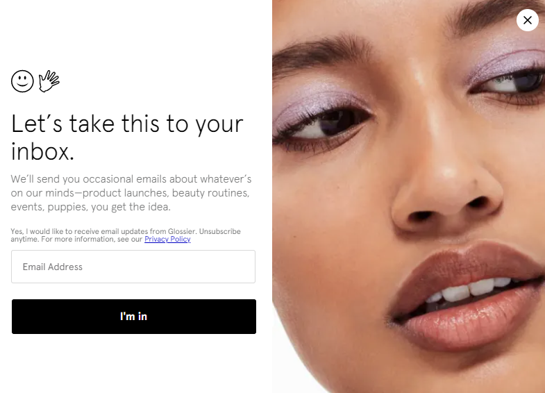
The emojis add an extra touch of oomph to it, compelling the audience to enter their email address and get this going!
BarkBox steals this idea and executes it just as brilliantly:
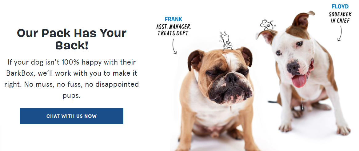
This CTA is fun, quirky, and adorable. It’s perfect for fun-loving dog owners.
While BarkBox has aced the CTA game, they’ve also mastered the art of writing audience-centric landing page web copy (we touched upon this earlier).
When combined, these two strategies yield powerful results!
5. Lead with Simplicity
To make a conversion-friendly landing page, keep the web design and development simple.
You may be tempted to go all out.
Add a splash of color here, introduce a new font there, throw in a quirky picture here, toss a video on the side, switch up the navigation, add an unexpected pop-up there…
If this is your train of thought, we’ll have to stop you right there.
Yes, fun, quirky web elements work for specific audiences. But even then, there’s such a thing as going overboard.
If the web design is clunky, overwhelming, and noisy, your audience will bounce off your site. And if your landing page is overdeveloped (yes, there is such a thing), it’ll be too difficult for web users to browse.
Lead with simplicity.
Even if your audience comprises 8-year-olds, don’t over-embellish the page to the point that it turns into an eyesore.
You would imagine that M&M’s landing page would be rainbows, sparkles, glitter, sunshine, and all-things-nice. Yes, it’s all of that… but balanced.
Take a look:

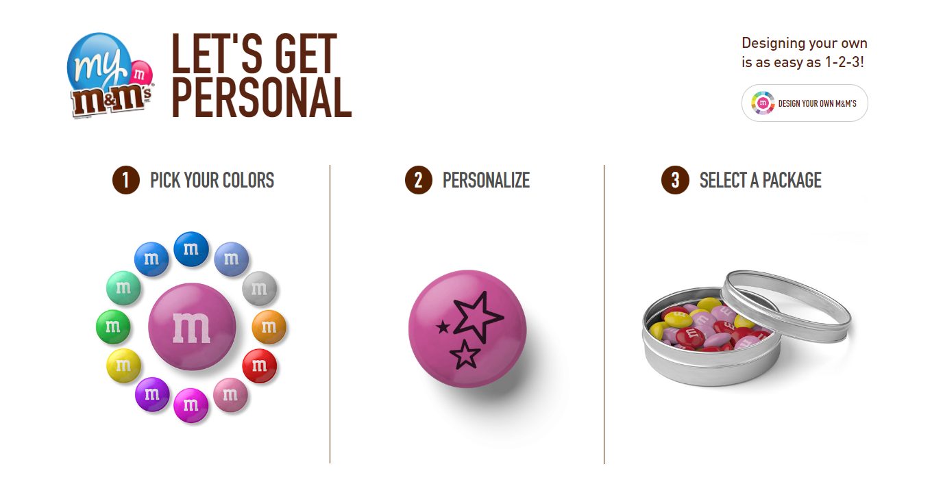
The fonts are clean, not exaggerated. The bottom panels feature a clean, white background to balance the green colour on top.
Your site should be easy on the eyes and easy to browse. Keep this in mind. If you get this mix right, you’re in for spectacular sales.
6. Equip Your Page with the Right Functionalities
As you develop your landing page, make sure you develop it well. Focus on these functionalities:
- WYSIWYG: Your page should be equipped with WYSIWYG (what you see is what you get) capabilities. This means that you’ll be able to see what the end result looks like.
WYSIWYG makes the landing page development process much, much easier and faster. Play around with different colors, layouts, fonts, and elements as you deem fit. You can stretch your imagination as much as you want to achieve the perfect outcome.
WYSWYG also allows you to change the content in its own easy-to-use editor instead of using a clunky, complex content management system.
- A/B Testing: Before you launch your page, make sure you run A/B testing to determine its efficacy.
You’ll essentially display the same page (or a specific element from the page) to your audience or a group of people. You’ll understand which one performs better as the two versions are compared.
When done right, A/B testing helps landing page developers maximize user engagement, minimize the bounce rate, and, of course, boost conversions.
You can use Google Optimize for effective A/B testing.
- An Advanced Web Analytics Tool:This isn’t just important; it’s imperative.
How is your page performing? How many views is it receiving? Is the time an average web user spending on it adequate? What is the bounce rate? How many web users are you converting?
Make sure you use an advanced web analytics dashboard to track everything from impressions to clicks to conversions.
You can also use Google Analytics.
7. Make Your Landing Page Mobile-Friendly
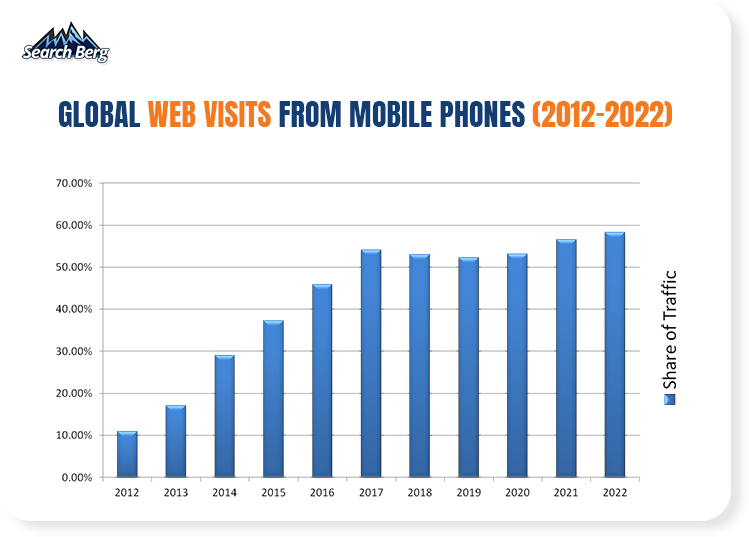
Source: Gs.statcounter.com
Take a closer look at this graph. As of 2022, an astounding 58.26% of total web visits are from mobile phones. A big, big chunk of your audience comprises mobile phone and smartphone users.
If your landing page isn’t mobile-friendly, you lose 58.26% of your revenue. Get your conversions back on track by implementing a responsive, user-friendly, interactive, and, most importantly, mobile-friendly layout.
Here’s a closer look at Later’s incredible landing page:
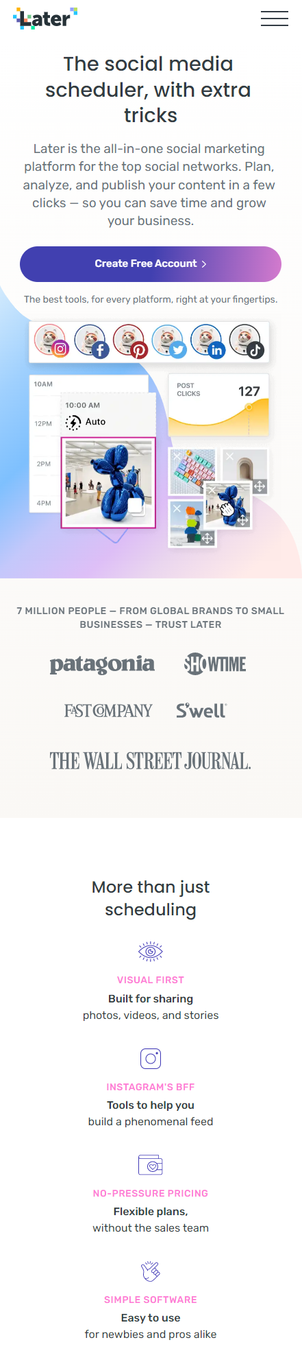
Not only is it mobile-friendly, but it’s also a visual feast. Clean, modern, minimalist design combined with a crisp font and a classic color palette… we want to buy from them immediately!
A mobile-friendly landing page will make you, as a business, more accessible to your audience. Web users can look up your site while they’re sitting at home, riding a taxi, catching a flight, or rushing to a meeting.
Make sure you use seamless swiping functionalities and gestures to optimize the user experience further. Users should be able to zoom in, zoom out, hold and drag, double touch, touch and drag, and so on.
Keep up with the most commonly used features and gestures to ensure your landing page is interactive.
Your interface should also feel intuitive, not clunky. Incorporate touch ID into your landing page design to go the extra mile. This is a great way to boost security and show your audience that their privacy matters to you.
Web users often hesitate to buy from sites that don’t have these measures in place. In other words, you’re losing a sale. By introducing these features, you’ll stabilize your conversions and gain the trust of your audience.
Need more insight into mobile-friendly sites? Click here.
Want to build a visually stunning, mobile-friendly site? You know who to call! Sign up for a free consultation with Search Berg today.
8. Don’t Push It… Ever!
Certain things are very off-putting to just about any audience. Whether you’re building an interior design, healthcare, travel, beauty, tech, automobile, or interior design landing page, make sure you avoid pushing your audience into something.
What do we mean by this? If your web copy is persistent, pushy, and commanding, your audience will head towards the nearest exit.
Using words like “must”, “now”, “stat”, and “go” is a great way to create urgency. However, there’s a very fine line between gentle nudges and overbearing commands.
Be very careful with the phrasing to avoid making your audience feel “forced” into something. At the same time, avoid being too salesy. These two mistakes can easily mess up your conversion rate.
9. Start a Conversation
As humans, we love to socialize. If we’re presented with the opportunity to express our thoughts or engage in a conversation, we love to take it (as long as we have some time).
Here’s the trick. The longer you keep web users on your landing page, the greater the chances of a sale. You can’t reel them back in if they bounce off your site within the first few seconds.
Here’s how you fix this. Start a conversation from the get-go. As soon as a web user lands on your landing page, a chat widget should pop up towards the bottom left portion of the screen.
You may opt for a live chat option or even a chatbot that collects questions through Facebook Messenger. Either way, adding the element of interactivity to your page will help web users have insightful conversations and get answers to their questions.
Not only does this approach invoke man’s natural affinity for conversation, but it also adds a human element to the mix. Web users aren’t browsing your landing page alone; there’s another human behind a screen ready to guide them through and through.
This instinctive realization compels people to stick around, keep asking questions until they’re satisfied, and possibly make a purchase. If a web user is in doubt, you’ll also manage to clear up their concerns and prompt a sale.
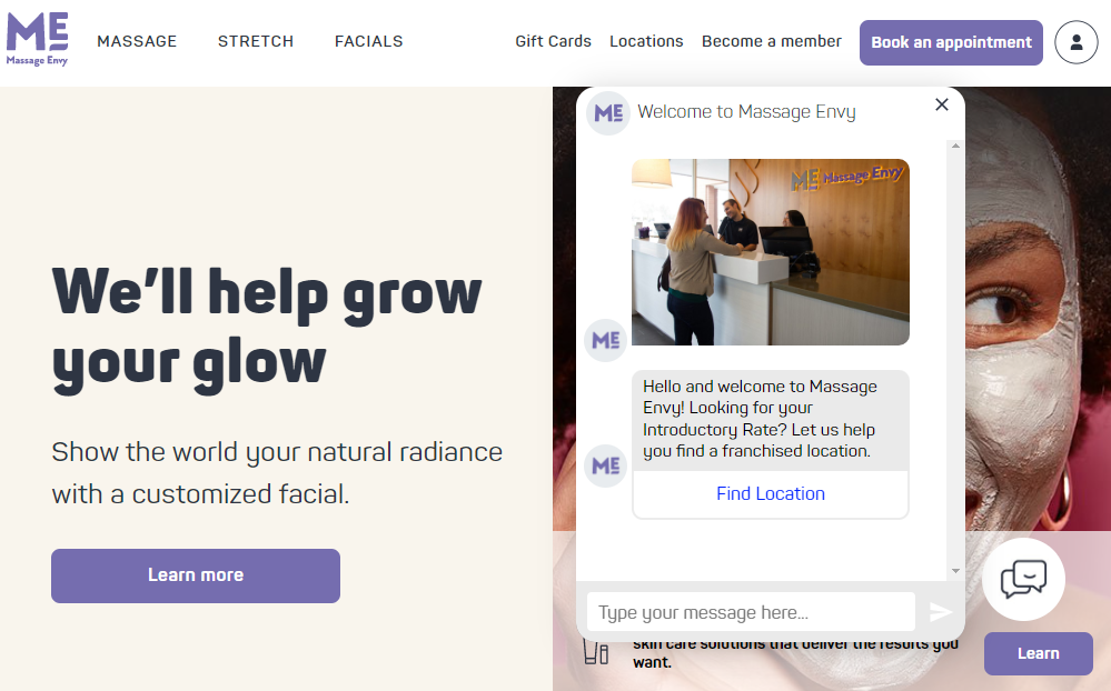
There are numerous benefits of this approach. It works like a charm every single time. We love Massage Envy’s chatbot:
In addition to adding a chatbot, make your landing pages chat-friendly. If a web user closes the chatbot, they should still be able to ask questions through the page. UserBrain pulls this off seamlessly:
Your customer service team should be patient, polite, well-informed, and courteous. Remember, web users who are dissatisfied with your business will also engage with the chatbot. Your team shouldn’t lose their patience at any point.
This is a great opportunity to prove how excellent your customer service is. As you placate angry customers, inform web users, and answer queries, you’ll establish meaningful connections with your audience.
The outcome? An improved brand identity and sweeter sales.
10. Prove That People Love What You Do
The power of testimonials, reviews, ratings, and referrals cannot be denied… ever. A whopping 95% of web users read reviews before they make a purchase.
Now, if your landing page gives this information to them, you’re essentially speeding up the buyer’s journey. Not only will you convert more people, but you’ll convert them faster.
Like the sound of that?
Here’s how you pull this off.
Provide proof!
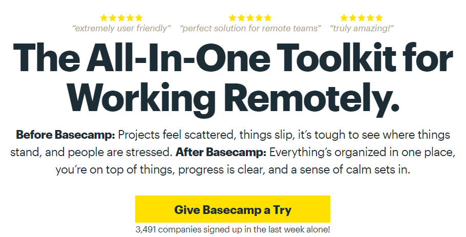
Basecamp does this beautifully. Their landing page starts off with three short reviews with star ratings.
Here’s a peek:
They follow this up with more reviews:
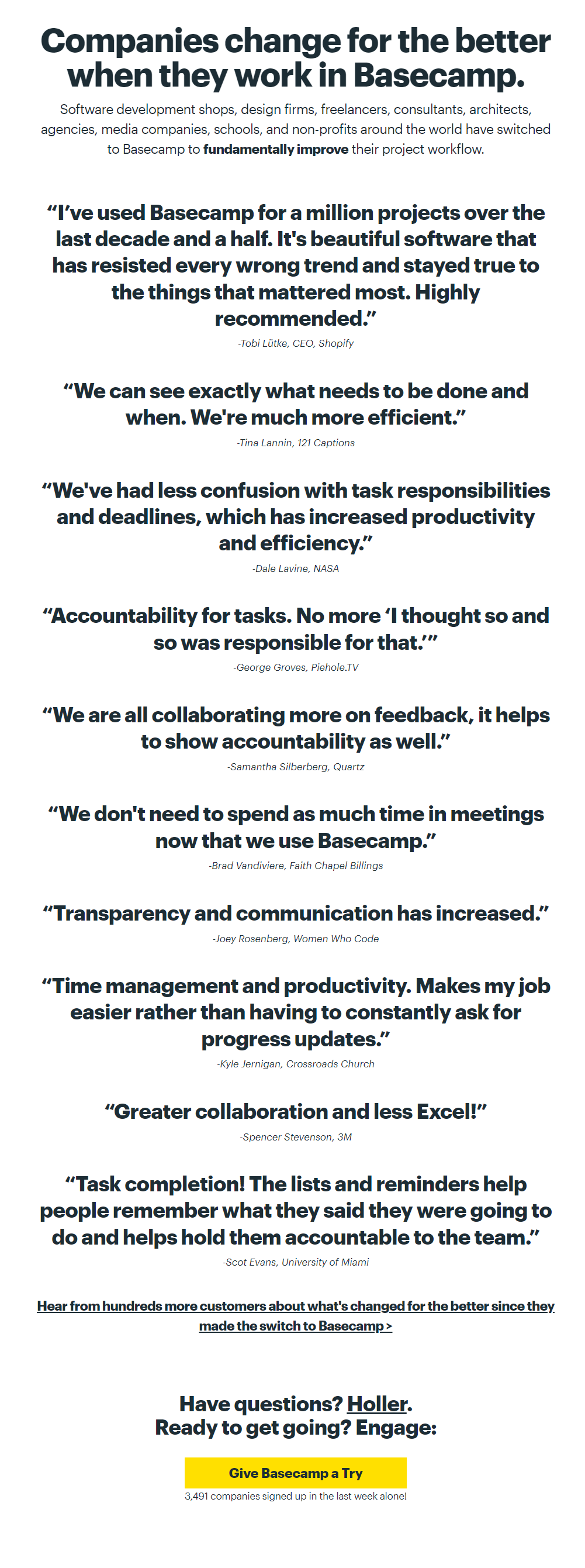
Brilliant and effective, this strategy helps you convert casual web users who weren’t really sure whether they’d buy from you.
Within a couple of seconds, you help them realize that your business is trusted by other customers, professionals, and companies.
Here’s another great example from Lucky Paws:
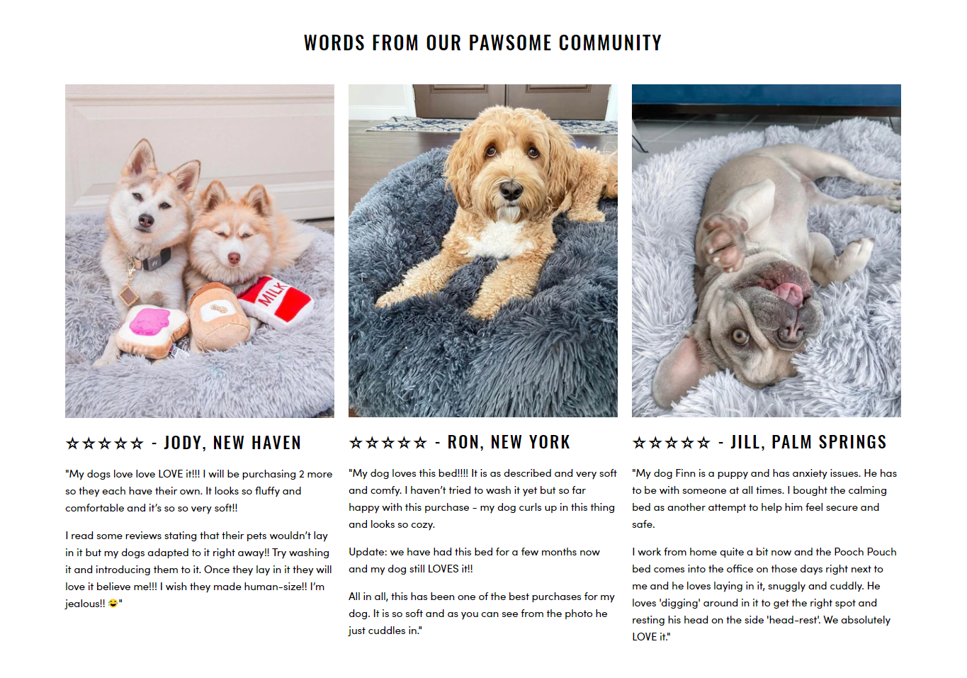
These guys have gone the extra mile by adding pictures of their clients’ dogs next to their testimonials.
The outcome? A bigger, sweeter impact.
As a dog owner, anyone would be smitten reading these reviews.
Pull this off, and you’ll watch the conversions come rolling in!
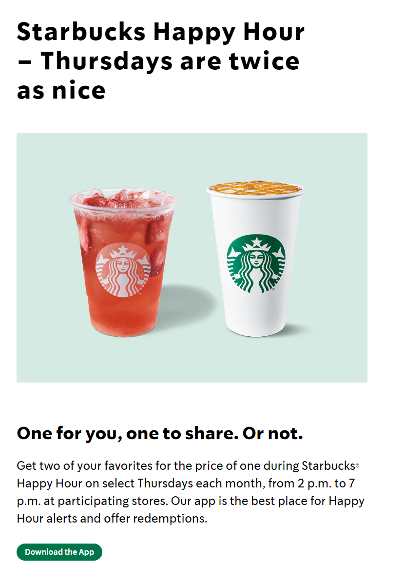
11. Offer Something
Web users love landing on a site and realizing they have an ongoing sale, special discounts, a buy 1 get 1 free offer, free goodies on bigger orders, a lucky draw, or anything exciting of the sort.
This is a great way to grab people’s attention, reel them in deeper, and win a conversion!
Starbucks’ happy hour landing page is a terrific example:
Crew also does this strategy justice:
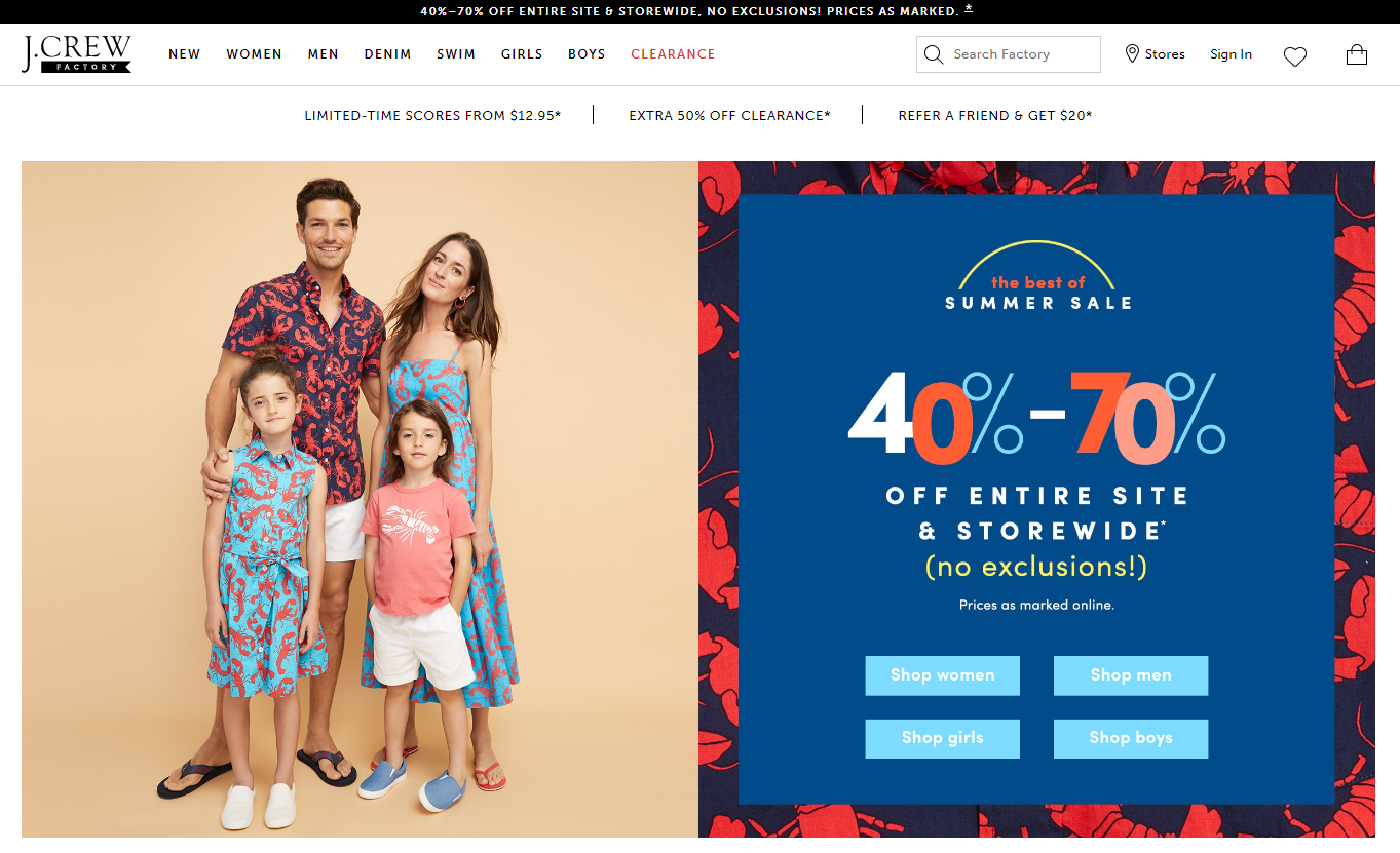
Whether you’re offering free samples, a kickass flash sale, vouchers, coupons, cashback promotions, loyalty programs, social media giveaways, referral discounts, or even free shipping and returns, make sure your landing page announces what you’ve got up your sleeve!
You’ll maximize your chances of making a sale and build a great brand identity.
12. Optimize, Test, Launch, Re-Test!
You’ve implemented a bunch of the strategies highlighted above.
Time to call it a day, right?
Nope, not so easily.
Many businesses underestimate the importance of conversion rate optimization and testing.
These are the foundation of building a conversion-friendly landing page.
As you kick things off, make sure you collect and analyze visitor data. Develop a good grasp of your audience and their preferences. This will help you make the right changes and keep your conversions on track in the long run.
Understand how users behave when they land on your site. What are your current page abandonment and bounce rates? What is the CTR rate now? Has it improved since you implemented a new strategy?
Closely track each aspect of page performance, including net promoter scores (NPS). As you collect and monitor quantifiable data, you’ll be able to maintain an updated user persona and customize your strategy accordingly.
Your work doesn’t end here. Follow this up with a rigorous, comprehensive competitor analysis.
Keep monitoring and analyzing your top competitors’ landing pages and performance to understand what works, what doesn’t, and what’s missing in your strategy.
This is one of the best ways to keep improving consistently.
Before you deploy your strategy, make sure you carefully test it. A/B testing is your best friend here.
As we discussed earlier, keep re-testing your landing pages to determine changes in performance, areas for improvement, techniques that simply aren’t working, and potential strategies you should but haven’t tapped into yet.
Last but definitely not least…optimization. Focus on on-page, off-page, and technical landing page SEO to become buddies with the Google algorithm.
The goal is to get noticed by those guys and make a brilliant impression!
The better you optimize your landing page, the greater your chances of showing up among the Google Local 3-Pack and getting a flood of new visitors and conversions.
The Google algorithm is very hard to please. To win it over and get your landing pages crawled, indexed, and ranked better, you need the right strategy from an experienced SEO specialist.
Read our previous blog on optimizing web content for better reach and conversions for a better idea of how to pull this off.
Building a conversion-friendly landing page is about understanding your target audience and giving them exactly what they want.
Once you ace this process, you’ll find yourself consistently ranking high on Google SERPs, earning a nice stream of traffic, getting more calls, bagging enviable conversions, and achieving impressive growth.
It’s that simple… when done right! That’s what we’re here for!
This Blog at a Glance
In this blog, we helped you understand how to design landing pages that convert.
We covered the most effective strategies that yield powerful results: brilliant CTAs, audience-centric web design and copy, the right web development functionalities, mobile-friendliness, customer reviews, and more!
Ready to kick things off? At Search Berg, we have a knack for designing conversion-friendly landing pages that help secure your bottom line.
Explore our web design and development services to determine how we can help.
Choose the right package for your needs, and give us a call when you’re ready!
Let’s start building landing pages that stand out, make an impact, and win over your audience. It all starts here!